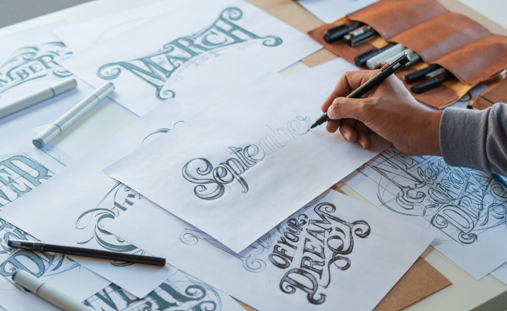
How often do you think about fonts? Although we all see them every day (you’re looking at one right now as you read this blog post), we probably don’t think much about them. Not unless printing is your job, that is. That describes our team at The Print Factory, so we do actually spend some time thinking about fonts while we do our job of printing in NH. We touched briefly on font choice in our previous blog post about designing business cards, but there is plenty more to talk about.
Fonts are pretty important when it comes to NH printing. There are several things to consider, but most are included in the answers to these two questions.
How easy is it to read?
Legibility should always be your top priority. You want to get your message across, so potential customers need to be able to read it. Decorative fonts are fine for initials, single words, or even short headers, but they can be difficult to read in longer texts or small sizes. For example, if you are trying to squeeze all your contact details onto your business card, it’s best to use a simple font. The same goes for short paragraphs in a flyer or on a poster explaining a service or promotion.
What impression does it make?
Choosing a font is about more than whether or not people can read it. Different styles also make different impressions on the reader. Let’s look at four major categories of fonts and the message they convey to your reader or potential customer:
- Serif: The name “serif” refers to the little flourishes that project from the letters. The font we use on our website is a serif font. Serifs are the traditional style and project a sense of history, heritage, and trustworthiness.
- Sans serif: This font style’s name simply means that it doesn’t have serifs. They have a sleek and clean look, making them popular for tech companies or brands that want to emphasize a modern feel.
- Script: These fonts imitate handwriting and show off a brand’s individuality and creativity. Most printers and graphic designers recommend that you use them sparingly, however, because they can be difficult to read.
- Decorative: Finally, we have decorative fonts. They are best for logos and short headers when you want instant brand recognition. Major brands often design their own decorative fonts for that exact reason.
